What Exactly is Watercolor Architectural Rendering? Unveiling the Art and Technique
So, what makes watercolor architectural rendering so special? It’s more than just painting a picture of a building. It’s a distinct artistic approach that blends technical representation with emotive expression, offering a refreshing alternative to more clinical digital visuals.
Defining the Craft: Visualizing Architecture with a Watercolor Touch
At its heart, watercolor architectural rendering is the practice of using the watercolor medium—whether applied traditionally with brushes and paper or simulated digitally with software—to create a visual representation of architectural designs. This could be anything from a grand public building to a cozy home interior or a sprawling landscape plan.
- Core concept: The key is the use of watercolor’s characteristic transparency, fluidity, and color blending to depict architectural forms and spaces.
- More than just a picture: This technique excels at conveying emotions and creating a distinct atmosphere around a project. It’s not just about showing what a building looks like, but how it *feels*.
- Not always about precision: While accuracy is important, watercolor architectural rendering often prioritizes capturing the overall ideology and visual impression of a design rather than insisting on absolute, minute-by-minute accuracy in every detail. This allows for a more interpretive and often more engaging result.

The Unique Aesthetic: Why Choose a Watercolor Architectural Rendering Style?
Architects and clients are often drawn to the distinctive visual qualities that watercolor brings to the table. These characteristics set it apart from other rendering methods:
- Emotional and Atmospheric Impact: Watercolor renderings are frequently favored for their remarkable ability to evoke specific emotions and truly capture the intangible feeling of a space. This can sometimes be challenging to achieve with purely digital, photorealistic renderings that might feel too sterile or cold.
- Soft, Dreamy, and Relaxed Quality: The gentle, often layered application of watercolor paint naturally creates a softer, more relaxed, and less rigid image compared to highly detailed and sharply defined digital renderings. This can make the design feel more approachable and inviting.
- Highlighting Key Design Elements: Artists can strategically use the properties of watercolor—its ability to create both subtle washes and vibrant focal points—to emphasize specific design elements, important colors, or unique textures. This helps to guide the viewer’s eye to the most crucial aspects of the architectural project.
- Conceptual and Artistic Freedom: Watercolor architectural rendering is often an excellent choice for conceptual designs and early-stage presentations. It allows for more creative interpretations and encourages a focus on the overall vision and artistic intent rather than getting bogged down in precise, early-stage detailing.
A Brief History: The Legacy of Watercolor in Architectural Visualization
The use of watercolor for depicting architectural ideas is not a new phenomenon; it boasts a rich history stretching back hundreds, even thousands, of years. Its journey is intertwined with the evolution of art and architecture itself.
- Centuries of use: While its earliest forms can be traced to ancient cave paintings where natural pigments were mixed with water, watercolor gained significant recognition as a refined artistic medium during the Renaissance. Visionaries of that era began to explore its potential for illustrating their grand designs.
- Notable historical examples: Over time, many renowned artists and architects have employed watercolor to capture architectural subjects. Think of the evocative travel sketches of Egyptian temples by David Roberts in the 19th century, the detailed depictions of Pompeii by Luigi Bazzani, or James Stuart’s views of ancient Athens. These works showcase the medium’s power to document and interpret architecture.
- The transition: These traditional, hand-painted techniques laid a vital foundation, influencing how artists approach architectural representation even today. The principles of composition, light, and color established through centuries of manual watercolor work continue to inform and inspire modern digital adaptations of the watercolor architectural rendering style.

Traditional vs. Digital Watercolor Architectural Rendering: Understanding the Two Main Approaches
When you’re considering a watercolor architectural rendering, you’ll generally encounter two primary methods: the time-honored traditional approach and the increasingly popular modern digital technique. Both have their unique strengths and applications.
The Classic Method: Traditional Manual Watercolor Architectural Rendering
This is the original art form, relying on the artist’s skill with physical tools and materials. It’s about the direct connection between hand, brush, paint, and paper.
- What is manual rendering? Simply put, it involves using your hand to draw or sketch the architectural design and then applying watercolor paints to bring it to life. It’s a tactile and often very personal process.
- The tools: The essentials are straightforward: a good quality brush (or several), watercolor paper designed to handle moisture, and a set of watercolor paints.
- Strengths: This method is prized for its inherent expressiveness and the unique artistic touch that only a human hand can provide. It can effectively convey key features and the essence of an architectural space even without striving for photographic realism. There’s often a warmth and charm to manual renderings. As one expert, Geddes Ulinskas, noted, he was drawn to the “lightbox effect and translucence of watercolor” from a young age.
- Challenges: Manual watercolor demands careful planning and a good understanding of the medium. Correcting mistakes can be quite difficult, as watercolor is not very forgiving once applied.
- Cost-effectiveness: For smaller, one-off projects or quick conceptual studies, traditional manual watercolors can often be a quicker and more cost-effective solution.
- The artist’s hand: Experienced artists who are adept at both manual rendering and understanding architectural principles can effortlessly create hand-rendered illustrations that are both beautiful and informative.
The Modern Evolution: Digital Watercolor Architectural Rendering Techniques
With the advancement of technology, artists can now create stunning watercolor-style renderings using sophisticated 3D software and digital painting tools. This approach combines the aesthetic appeal of watercolor with the flexibility of digital workflows.
- What is digital watercolor architectural rendering? This method involves using computer software to simulate the look and feel of traditional watercolor painting.
- The workflow: Often, the process for creating a digital watercolor architectural rendering shares similarities with producing a standard photorealistic rendering, but with an additional artistic layering step.
- Base model creation: A 3D model of the architectural design is typically created first, using software like SketchUp or other CAD programs.
- Exporting views/linework: Specific views or line drawings are exported from the 3D model to serve as a guide.
- Applying watercolor effects digitally: Using software such as Adobe Photoshop or Procreate, artists then apply digital watercolor brushes, textures, filters, and blending techniques to achieve the desired artistic style. This is where the “painting” happens, albeit on a digital canvas. As Atelier Crilo described their process, it’s a “traditional technique revisited with digital tools.”
- Advantages: The digital approach offers significant benefits, including much greater flexibility for revisions and changes (colors can be altered, elements moved more easily), potentially faster turnaround times for complex projects, and a high level of customization to achieve a specific look.
- Hybrid renderings: Many studios, like Genesis Studios, offer “hybrid renderings” which aim to carry on the tradition and history of hand-drawn art but with the convenience of digital modifications.
Comparing Manual and Digital: Pros, Cons, and When to Choose Which
Both traditional and digital methods for watercolor architectural rendering have their place. The best choice often depends on the specific project needs, budget, timeline, and desired aesthetic.
| Aspect | Manual/Traditional Watercolor Rendering | Digital Watercolor Rendering |
|---|---|---|
| Artistic Uniqueness | High; each piece is an original, hand-crafted artwork. Possesses a unique tactile quality. | Can achieve a high level of artistry, but effects are simulated. Easier to replicate or create variations. |
| Revision Flexibility | Low; correcting mistakes or making significant changes is very difficult and often impractical. | High; colors, elements, and even compositions can be altered much more easily using layers and digital tools. |
| Turnaround Time | Potentially faster for simple, small-scale projects (e.g., 2-3 days for a draft). | May take longer for initial setup of complex 3D models, but potentially faster for revisions. Drafts for typical projects might take 5-10 days. |
| Cost | Can be 2-3 times cheaper for straightforward, smaller projects. | Generally more hours required for modeling, texturing, and digital painting, especially for complex 3D scenes, which can increase cost. However, revision costs might be lower. |
| Consistency for Multiple Views | Challenging to maintain perfect consistency across multiple hand-painted views of the same project. | Easier to maintain consistency in style, color, and detail across multiple views derived from the same digital model. |
| Best For | Smaller one-off projects, conceptual sketches, portfolio pieces showcasing traditional skill, clients valuing unique handcrafted art. | Larger, more complex projects, designs requiring frequent revisions, projects needing multiple consistent views, clients valuing speed and digital adaptability. Digital watercolor architectural rendering for commercial projects. |
Ultimately, the decision between manual and digital often comes down to balancing the desire for a unique, handcrafted feel with the practical needs for flexibility, scalability, and budget in a given architectural project.
Mastering the Techniques: How to Create Stunning Watercolor Architectural Renderings
Whether you’re aiming for a traditional masterpiece or a digital creation with a watercolor soul, understanding the core techniques is crucial. Let’s explore some of the foundational skills and specific methods used to bring watercolor architectural renderings to life.
Foundational Skills: Sketching and Perspective in Watercolor Architecture
Before any paint touches the paper (or digital canvas), a solid understanding of drawing fundamentals, especially perspective, is essential. This groundwork ensures your architectural subjects look believable and well-proportioned.
The Importance of a Good Underdrawing
A careful preliminary sketch serves as the roadmap for your watercolor painting. It helps you:
- Stay on track: Having clear outlines for buildings, landscape elements, and details helps guide your application of washes and prevents things from getting muddled.
- Plan composition: You can work out the placement of elements and the overall balance of your image before committing to paint.
- Define key features: Use light pencil lines to map out important architectural features, trees, rock projections, and even where shadows might fall.
Architectural Perspectives in Watercolor: Creating Depth and Realism
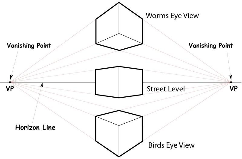
Perspective is the art of representing three-dimensional objects and spaces on a two-dimensional surface in a way that creates an illusion of depth and distance, mimicking how an observer would see the scene in reality.
- Key tips for exterior perspectives:
- Horizons: Generally, use only one horizon line, as this naturally appears at an observer’s eye level. On your picture plane, placing the horizon line low can often create a more dynamic composition.
- Distance: Remember that objects further away appear less defined, have softer edges, and exhibit less color saturation compared to closer objects. This is called atmospheric perspective.
- Vanishing points: If the observer is at street level, parallel lines on buildings (like the edges of windows and rooflines) will appear to converge towards one or more vanishing points on the horizon line.
- Simplifying details: When depicting surrounding buildings or distant elements, it’s often best to visualize them as abstract shapes. Indicate their presence without getting bogged down in minute details like doorknobs, individual window panes on far-off structures, or gutters.
- Example: Tutorials like those by John Lovett can be incredibly helpful for understanding how to accurately find and use vanishing points in watercolor renderings.
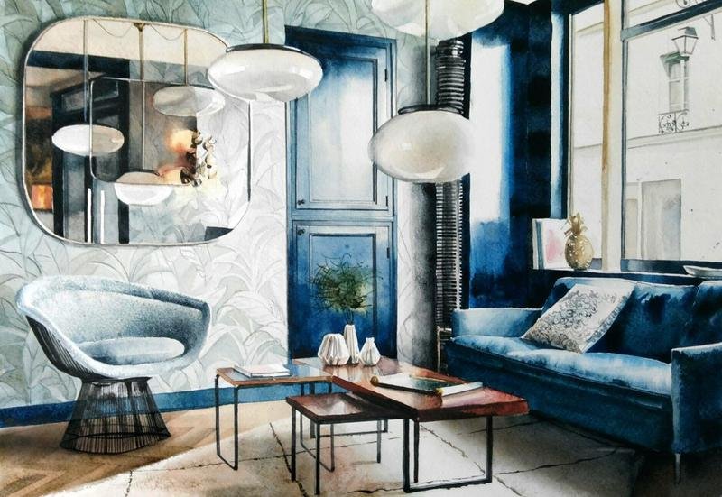
Interior Perspectives in Watercolor: Capturing Indoor Spaces
Painting interior scenes in watercolor can be particularly challenging due to the often strong, converging perspective lines and complex lighting situations, which might involve single or multiple artificial light sources.
- One-point perspective: This technique works best if your design features scenes within smaller, more contained spaces. The observer is often positioned to look directly down the middle of a room or along a corridor.
- Two-point perspective: This is generally more suitable for larger interior spaces, such as shopping malls, grand halls, and theaters, where lines appear to converge on two distinct vanishing points on the horizon.
- Importance of intersections: Both one-point and two-point perspectives rely on correctly establishing the intersections where walls meet floors and ceilings. When placed accurately, these intersections effectively reveal the sense of distance and space within the interior.
- Handling lighting and reflections: Interiors typically have many reflective surfaces (windows, polished floors, mirrors) and often multiple artificial lighting sources. This creates complex sets of cast shadows and highlights that need careful observation and rendering.
Urban Watercolor Renderings: Depicting Cityscapes
Before diving into painting complex cityscapes with watercolors, it’s crucial to first sketch the design of the urban scene to establish strong compositions. The sense of depth in urban watercolor renderings relies heavily on understanding and applying different types of perspective:
- Linear Perspective: Widely used since the Renaissance, urban renderings often feature wide visual fields where all parallel lines appear to converge towards one or two vanishing points on the horizon.
- Cylindrical Perspective: Such designs can resemble a flattened view of the interior of a cylinder and are used to capture a very wide, almost 180-degree, line of vision. In this type of perspective, vertical lines remain straight, but horizontal lines become curved and somewhat distorted.
- Spherical Perspective: This perspective aims to create an image similar to what you might see when looking at the interior of a sphere. Both horizontal and vertical lines will appear distorted and curved.
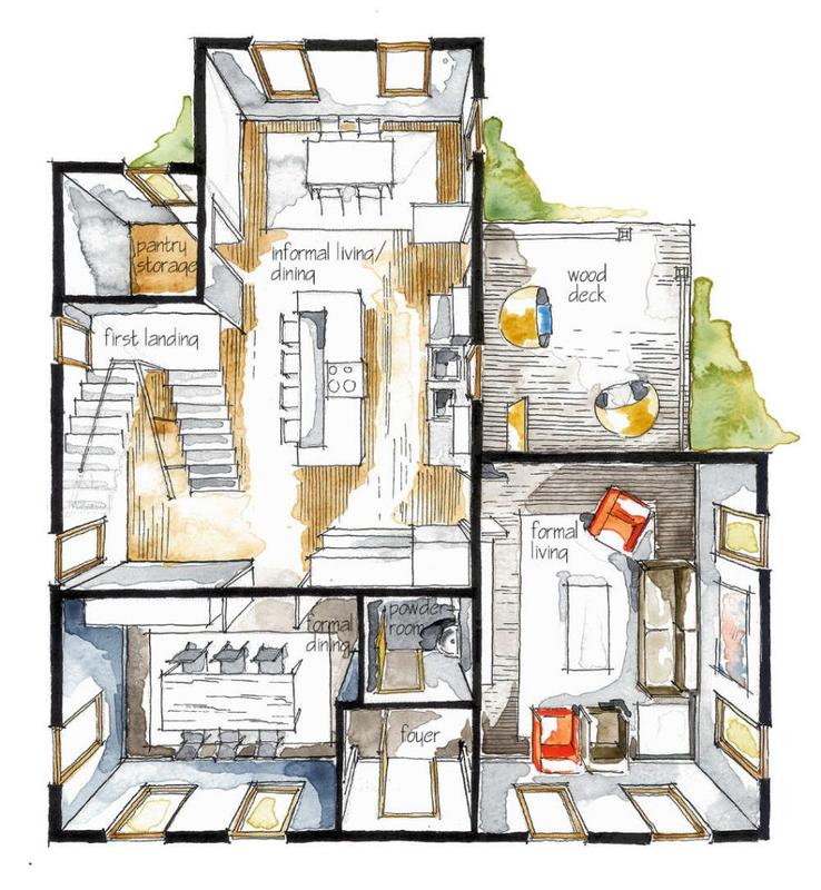
Plan Watercolor Renderings: Illustrating Layouts and Floor Plans
Watercolor rendering can be a wonderful way to illustrate the overall idea and character of layout plans or floor plans for any architectural design project. While conventional 2D plans primarily specify the size and placement of various elements, watercolor architectural rendering can produce 3D-like plans that beautifully illustrate the project’s architectural character, sense of scale, and intended materials.
- Process: Generally, the first task is to lightly draw elements like trees and rock projections in pencil. Then, apply shadows on the ground areas. Following this, you can render lawns and contours using the same number of light washes to build up color and form, before finally adding details to walls, partitions, and furniture.
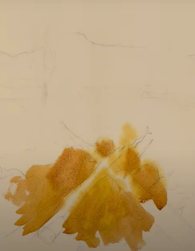
Essential Watercolor Painting Techniques for Architectural Subjects
Beyond drawing, mastering specific watercolor application techniques is key to achieving the desired effects in your architectural pieces. These range from basic washes to more advanced textural methods.
Basic Watercolor Washes: The Building Blocks of Your Painting
Washes are fundamental to watercolor. They involve applying diluted paint evenly or with variation over an area of the paper.
- The Flat Wash: Start applying your chosen diluted paint (the “wash”) at one end of the area you want to cover, allowing it to form a small puddle or “bead.” Gently tilt your board or paper in various directions so the bead of paint flows evenly across the surface. Finally, use a clean, damp (“thirsty”) brush to carefully soak up any excess wash at the end of the stroke. This creates an even layer of color.
- One-color Graded Wash: This technique follows a similar process to the flat wash. However, you typically wet the paper with a clean sponge or large brush before applying your chosen wash at one end. Then, allow the wash to spread and dilute naturally as it flows across the wet paper, creating a smooth transition from a darker to a lighter tone (or vice-versa).
- Two-color Graded Wash: While this technique is similar to the one-color graded wash, you’ll use two different washes of your chosen colors. After applying the first wash from one end of the wet paper, apply the second wash from the opposite end and allow the two colors to meet and blend softly towards the center.
- Three-color Graded Wash: This technique uses three distinct washes. First, ensure your board or paper is evenly wet. Then, apply each wash at different points—perhaps one in the center, one on the left, and one on the right side. Gently tilt the board back and forth to encourage the washes to distribute and blend softly. Finally, use a thirsty brush to soak up any excess wash.
- Graded Wash with a Central Vertical Shine: If you want to create cylindrically shaped designs, such as tree trunks or curved walls, this technique is useful. Follow the same process as the one-color graded wash, but let the gradation finish towards the center of the shape. Once this first application is dry, repeat the process from the other side of the shape, again letting it fade towards the center, leaving a lighter “shine” area.
- Graded Wash with a Diagonal Shine: While this technique follows a similar principle to the Graded Wash with a Central Vertical Shine, you’ll start applying your wash in the corners of an area and let the gradation finish towards the center, creating a diagonal highlight.
- Glare Wash: For this technique, you need a dry board or paper, irrespective of whether you are aiming for a flat wash or a graded wash. Don’t tamper with the wash or try to rework it once it is laid down on the dry surface; let it settle naturally.
- Two Glare Washes: Once you apply the first glare wash and let it dry completely, you can then apply another wash, often with a darker tone or a different color, over it. It is advisable to use striking patterns or textures for the second application if desired.
Core Techniques for Beginners in Watercolor Architectural Rendering
If you’re just starting out, these four key techniques will give you a great foundation:
- Wet-on-wet: This involves applying wet paint onto an area of the paper that is already wet (either with water or a previous wash). It’s perfect for painting soft, blended areas like simple skies and atmospheric landscapes because it gives a beautiful, flowy effect with soft edges.
- Wet-on-dry: Here, you apply wet paint onto a dry area of the paper (or a completely dry previous layer of paint). This technique is best for illustrating more defined shapes, crisp edges, and detailed elements.
- Building up Color: This technique allows you to gradually build up color intensity. You can do this by mixing plain water with your paint to create lighter values for initial layers, and then applying subsequent layers with less water (and thus more pigment). You can also use one color and vary its dilution to create a seamless gradient effect often called an “ombré.”
- Creating Gradients with Multiple Colors: This technique helps you build up color and create smooth transitions by mixing plain water with different values of two or more adjacent colors on the color wheel (e.g., blending a yellow into an orange, then into a red for a sunset).
Pro Tip for Beginners: Always sketch your architectural designs lightly in pencil first. This will serve as a valuable guide and keep you on track when applying layers of washes, helping you to preserve important shapes and details.
Advanced Watercolor Techniques for Unique Effects and Textures
Once you’re comfortable with the basics, you can explore more advanced methods to add fascinating textures and effects to your watercolor architectural renderings:
- Washed Ink: Start by applying waterproof ink (like India ink) to create lines or shapes. Let it dry completely, and then you can gently scrub some areas with a slightly damp, rough bristle brush to lift some ink and produce interesting textures. This technique is often used before adding watercolor washes over the ink.
- Sprayed Ink: This technique often uses permanent artist ink to help unify a painting or add a specific textural quality. Once you apply the ink (perhaps by splattering or dripping), you can lightly spray it with fine water from an atomizer bottle. As the water interacts with the wet ink, it can create soft, irregular textures reminiscent of an ancient, weathered coating.
- Candle Wax Resist: Since candle wax naturally resists water-based paint, you can use an uncolored wax candle (or wax crayon) to draw onto your paper to preserve white areas before applying paint. It also helps you to preserve washes of underlying color if you apply wax over a dry painted area before adding another layer. The subsequent watercolor washes will not adhere to the waxed areas.
- Sanding Dry Paper: You can use fine-grade sandpaper to create unusual textures on a completely dry watercolor painting by sanding its surface very lightly. Be gentle! You can then fine-tune these sandpapered areas by applying further light washes if desired, which will interact differently with the abraded surface.
9 Creative Watercolour Texture Techniques (Detailed Exploration)
Adding visual texture can truly elevate your watercolor architectural renderings, giving them depth, dimension, and a unique character. Here are nine creative methods to explore:
- Dry Brush Technique: Create texture by using a brush that is relatively dry, holding a good amount of pigment but very little water. Dab excess moisture off on a cloth. Swiftly drag the brush across the paper; the paint will catch on the raised parts of the paper’s texture (“the tooth”) and skip over the lower areas, creating a broken, textural effect. Finding the right moisture balance is key.
- Splattering or Spraying: Load a brush (or even an old toothbrush) with watercolor paint. Then, use your finger or another brush handle to flick or tap the loaded brush over your paper. This creates random speckles or splatters, adding energy and texture. You can also use opaque gouache for splatters, especially towards the end of a painting for highlights.
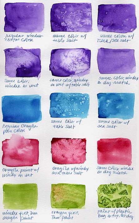
- Using Salt: Sprinkle ordinary table salt (coarse or fine) onto a still wet watercolor wash. As the salt crystals come into contact with the damp paint, they absorb moisture and push the pigment away, creating irregular, starburst-like patterns and granulated effects. The size of the salt influences the texture. Let it dry completely, then gently brush off the salt. Timing is crucial; the wash must be damp, not too wet or too dry.
- Watercolor Blooms (Cauliflowers/Back Runs): You can deliberately create these interesting effects, also known as cauliflowers, back runs, or blossoms. They occur when additional wet paint or clean water is carefully dropped into an area of the paper that has already been painted but is still damp (not fully wet and not fully dry). The new water or paint will spread outward, pushing the existing pigment away and creating a lighter, feathery-edged area or “bloom.”
- Sponges: Natural sea sponges or even regular kitchen sponges (cut into pieces) can be used to create wonderful textures. You can dip a damp sponge into paint and dab it onto the paper, or apply paint with a brush and then, while the paint is still wet, use a damp sponge to lift some color or create mottled patterns. Rotate the sponge to vary the texture.
- Scraping: Some artists use scraping techniques to add texture. Any tool with a hard, relatively sharp edge—such as a palette knife, an old credit card, or even a piece of stiff cardboard—can be used to scrape into wet paint, displacing it and revealing the paper or underlying layers. You can also let the paint dry completely and then carefully use a craft knife to scratch fine lines into the dry paint, revealing the white of the paper.
- Granulating Paints: Certain watercolor paints are naturally “granulating.” This means their pigments have a tendency to separate and settle into the textured valleys of the watercolor paper as they dry, creating a visually interesting granular or mottled pattern. Colors like French Ultramarine, Potter’s Pink, and Raw Umber are well-known granulating pigments. Schmincke even offers special ranges of super-granulating paints.
- Granulation Medium: If you want to achieve a granulating effect with colors that don’t naturally granulate, you can add a special “Granulation Medium” to your paint mixture. This medium alters the behavior of the pigments, encouraging them to settle and separate, resulting in a unique granular appearance. Some artists mix it directly with the paint, while others apply paint and then drop the medium onto the wet wash.
- Watercolor Paint and Plastic Wrap: Ordinary kitchen plastic wrap (cling film) can be used to create stunning and unpredictable textural backgrounds. Apply a wet wash of watercolor paint to your paper. While the paint is still very wet, take a piece of plastic wrap, crinkle it up a bit, and press it onto the wet paint. Use your fingers to gently move the plastic around to create interesting shapes and patterns. Ensure the plastic wrap makes good contact with the paper, allowing the paint to seep into the crevices. Let the paint dry completely, then carefully peel off the plastic wrap to reveal the textures.
Experimenting with these texture techniques will add a new dimension to your watercolor architectural renderings. Don’t be afraid to combine them and see what unique effects you can achieve!
Choosing and Using Colors Effectively in Watercolor Architectural Rendering
Color is the lifeblood of watercolor painting. Understanding how to choose, mix, and apply colors is essential for creating vibrant and harmonious architectural visuals.
- The Importance of Paint Quality: It’s generally advisable to use high-quality watercolor paints. These typically provide more control over the medium, respond more evenly to water, and can produce deeper, more brilliant shades. Lower-quality paints might be less predictable and less vibrant.
- Working with a Limited Palette: You don’t need every color under the sun! Many experienced artists work with a relatively small selection of primary colors (a good red, blue, and yellow) plus a few earth tones and perhaps a convenience green. From these, you can mix an incredibly wide range of hues. This also helps ensure color harmony in your painting.
- Transparency vs. Opacity:
- Watercolor is known for its transparency. Transparent colors allow the white of the paper (or underlying washes) to shine through, creating luminosity. For beautiful layering effects (glazing), it’s often best to apply transparent watercolors first, then build up with darker or more opaque coats if needed.
- Watercolors can vary in their transparency. Generally, they are classified into four levels: transparent, semi-transparent, semi-opaque, and opaque. Opaque colors will cover underlying layers more completely and can give a more chalky appearance if desired.
- Staining vs. Non-staining Colors: Some watercolor pigments are “staining,” meaning they penetrate the paper fibers and are difficult to lift out once dry. “Non-staining” colors, on the other hand, sit more on the surface and can often be easily lifted out from the paper using a damp brush or sponge, even when dry. Examples of non-staining colors include Antwerp Blue, Cobalt Turquoise, Green Gold, and Turner’s Yellow.
- Lightfastness: This refers to a pigment’s resistance to fading when exposed to light over time. For architectural renderings that you want to last, choose colors with high lightfastness ratings. The American Society for Testing and Materials (ASTM) provides a standard (ASTM D4303) with ratings like ASTM I (Excellent Lightfastness), ASTM II (Very Good), and ASTM III (Not Sufficiently Lightfast for Artist’s Use). This information is usually found on the paint tube or packaging. It’s wise to avoid colors known to fade easily, such as some formulations of Alizarin Crimson, Cobalt Yellow (Aureolin), Opera Pink, and Rose Madder Genuine.
- Using a Color Wheel for Harmonious Schemes: A color wheel is an invaluable tool for understanding color relationships and creating pleasing color combinations. Common schemes include:
- Analogous: Colors that are next to each other on the color wheel (e.g., blues and greens).
- Complementary: Colors opposite each other on the wheel (e.g., greens and reds), which create strong contrast.
- Triad: Three colors evenly spaced around the wheel (e.g., blue, red, and yellow).
- Analogous Complementary: A scheme using analogous colors plus the complement of one of them (e.g., yellows and oranges, with blues and violets as complements).
- Color Quality Considerations: Even if two brands share the same pigment name (e.g., “Ultramarine Blue”), their actual tones can still differ. This is due to variations in pigment concentrations and their proportion to other ingredients in the paint formula. Paints made with a single, high-quality pigment are often livelier and mix more cleanly than paints made with multiple mixed pigments. This is also a reason why your paint mixtures might get dull or “muddy” if you mix together too many different watercolors indiscriminately.
- Understanding how watercolor dries lighter: A key characteristic of watercolor is that it generally dries a few shades lighter than it appears when wet. It’s important to factor this in when mixing your colors and applying your washes. You might need to apply slightly darker or more intense washes than you initially think to achieve the desired dried result.
Pro Tip on Color Drying: The higher the quality of your watercolor paint and paper, often the more beautifully and predictably it will dry, retaining its vibrancy.
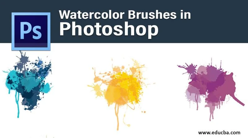
Integrating Digital Tools: Watercolor Architectural Rendering in Photoshop, Procreate, and SketchUp
The digital realm offers powerful ways to create or enhance watercolor architectural renderings, combining traditional aesthetics with modern flexibility.
Watercolor Rendering in Photoshop for architects
Adobe Photoshop is a versatile tool for achieving a watercolor effect, even if you’re not a traditional painter. You can apply these effects to an existing architectural rendering (perhaps a basic 3D model output) or build up the watercolor look from scratch.
- Applying effects: Various filters and adjustment layers in Photoshop can help impersonate the aesthetics of a hand-painted image, building up the watercolor effect gorgeously.
- Brushes and Textures: Using specialized watercolor Photoshop brushes, applying digital paper textures, and adding subtle distortions can lead to a more convincing and authentic result.
- Atelier Crilo’s Method: One detailed workflow involves exporting DWG (vector line) files from a 3D modeling program like SketchUp into AutoCAD. In AutoCAD, artists can “force the hand” by giving depth to contour lines, adding hatches as dots and crosses to simulate texture or shadow, and even tracing reference photos to create background landscapes with graded hatches. This prepared CAD drawing is then brought into Photoshop, where digital watercolor brushes are used to apply color and complete the illustration. An alternative, quicker method bypasses CAD by exporting raster images (like hidden line and wireframe views) directly from SketchUp and then overlaying and painting them in Photoshop.
Watercolor Rendering in Procreate for architectural illustration
Procreate, a popular iPad app, is another excellent tool for digital watercolor effects. It can help build your confidence with its wide-ranging painting and blending brushes specifically designed to mimic natural media.
- Brushes and Tools: Procreate also comes with thoughtful “stamp” brushes that can make the painting process more fun and less overwhelming by quickly adding textural elements or pre-made shapes.
- Realism: While you can achieve very realistic and beautiful results, it’s good to remember that the brushes can only mimic a fairly accurate appearance of a real watercolor effect; they don’t replicate the exact physical interaction of water and pigment on paper.
- Recommended Brushes: Some users suggest brushes with names like Blotch, Mad Splashes, Water Bleed, Wet Sponge, and Water Flicks for good watercolor effects in Procreate.
Watercolor Rendering in SketchUp for conceptual design
SketchUp has long been a standard software for architects due to its ease of use and wide-ranging modeling tools. While not a painting program itself, it plays a key role in many digital watercolor workflows.
- Process: The process often involves amazingly transforming hand-crafted design ideas (or even simple massing models made in SketchUp) into a base for a digital watercolor version. This helps produce a more artistic visualization of actual scenes.
- Combining Techniques: It effectively combines the manipulation of digital images (exported from SketchUp) with aesthetics reminiscent of traditional hand coloring, perhaps with digital markers or watercolor brushes in another program. SketchUp’s own “Styles” feature can also provide a starting point with various sketchy-edge or painterly looks.
The Benefits and Appeal of Choosing Watercolor Architectural Rendering
Why opt for a watercolor architectural rendering when there are so many other visualization styles available, particularly hyperrealistic digital ones? The answer lies in watercolor’s unique blend of artistic charm, emotional resonance, and ability to communicate ideas in a distinct way.
Differentiating Your Firm: Standing Out with a Unique Visual Style
In a competitive market often saturated with highly polished, sometimes sterile, digital photorealistic renderings, choosing a watercolor style can be a powerful differentiator. It allows an architecture firm or designer to:
- Move beyond the ubiquitous: Offering watercolor visuals can help your presentations and portfolio stand out from the crowd.
- Offer a distinctive aesthetic: It signals a certain appreciation for artistry and a different way of seeing and presenting architectural ideas, which can be very appealing to clients looking for something special.
Connecting Emotionally: How Watercolor Resonates with Clients
One of the most significant advantages of watercolor architectural rendering is its capacity to connect with clients on an emotional level. The artistic and often softer nature of watercolor can:
- Foster understanding: Help clients better understand and connect with a design concept in a way that goes beyond just technical specifications. As Hugo Render points out, “The emotions brought to light by watercolor artwork are simply unmatched.”
- Evoke feelings and atmosphere: Capture a sense of place, mood, and ambiance that highly precise digital renderings might sometimes fail to convey with the same warmth or subtlety.
Embracing Artistic Interpretation: The Appeal of Imperfection
Not every client or project demands absolute photographic precision. Watercolor allows for a more artistic and less technically rigid rendering, which can be highly appealing:
- Focus on the vision: It allows the focus to remain on the overall design vision, the interplay of light and color, and the intended atmosphere, rather than on minute, potentially distracting details, especially in early design phases.
- Client preference: Some clients are naturally drawn to the charm of a hand-crafted or artistically interpreted image, finding it more engaging or relatable than a purely technical representation.
As Geddes Ulinskas found, watercolor renderings often provide a “sense of completion for clients,” bridging the gap from concept to a more tangible, art-like reality.
Versatility in Application
Watercolor architectural rendering is not limited to one type of presentation; it’s a versatile tool that can be used effectively at various stages and for different purposes:
- Conceptual Designs: Ideal for illustrating initial ideas, mood boards, and early concept designs, showcasing the overall vision and spirit of a project without committing to precise details. Watercolor techniques are often “conducive to looser and less committed designs.”
- Visual Communication: An excellent way to communicate complex design ideas to clients, stakeholders, or the public in a visually appealing, easily understandable, and often more engaging manner.
- Portfolio Pieces: Beautiful watercolor renderings can serve as stunning additions to an architect’s or firm’s portfolio, effectively showcasing their artistic abilities, design philosophy, and stylistic range.
Specific Advantages for Interior Design Watercolor Rendering
When it comes to visualizing interior spaces, watercolor offers particular benefits:
- Quick and effective: It can be a relatively quick and easy way to produce visuals that effectively show the overall feel, color scheme, and atmosphere of an interior space.
- Forgiving for experimentation: Watercolor is a forgiving medium, especially in its digital form, making it great for experimenting with different color palettes, furniture arrangements, and compositional ideas without the fear of making irreversible “mistakes.”
- Clear communication: Watercolor renderings of interiors can provide a very clear visual representation of how a space will look and feel, which is extremely helpful in getting clients, decorators, and other team members on the same page.
Practical Aspects: Pricing, Services, and Common Mistakes in Watercolor Architectural Rendering
Understanding the practical side of watercolor architectural rendering is important, whether you’re looking to commission a piece, learn the craft yourself, or simply appreciate the effort involved. This includes considering costs, how services are typically offered, and common pitfalls to avoid.
Understanding Watercolor Architectural Rendering Services Prices
Determining the price for a watercolor rendering isn’t always straightforward, as it can vary significantly based on several factors. There’s no strict formula that can calculate a single, universal price for an illustration.
- Factors influencing price:
- Complexity of the design: A simple facade will cost less than a highly detailed cutaway view of a complex building.
- Timeframe and deadline: Rush jobs typically incur higher fees.
- Scale of the project: Larger or more numerous renderings will naturally cost more.
- Accuracy and detail of the provided model/information: If the artist has to spend significant time interpreting vague plans or building a 3D model from scratch, it will add to the cost.
- Perspective and viewpoint: Complex perspectives or multiple viewpoints can increase the workload.
- Artist experience and reputation: Highly sought-after artists with a strong portfolio will command higher prices.
- Number of revisions included: The scope for changes will affect the initial quote.
- Usage rights: How the image will be used (e.g., internal review vs. global marketing campaign) can influence pricing.
- Digital (3D) vs. Traditional (2D) Costs: Generally, digital watercolor rendering, especially if based on a detailed 3D model, demands more hours for modeling, texturing, lighting, and digital painting compared to a simpler 2D traditional watercolor painting. Consequently, traditional manual watercolors can sometimes be 2-3 times cheaper for basic, smaller-scale work.
- Estimating average prices: It’s genuinely hard to give a precise average price for watercolor illustrations due to this variability. One source mentioned reaching out to 20 watercolor artists in 5 different countries to achieve an average value, highlighting the diverse pricing landscape. For a very rough idea based on complexity:
- A small, simple traditional watercolor might start from a few hundred dollars.
- A more detailed traditional piece or a basic digital watercolor could range from several hundred to over a thousand dollars.
- Highly complex, large-scale digital watercolor renderings involving detailed 3D modeling could cost several thousand dollars.
It’s always best to get quotes from individual artists or studios based on your specific project brief.
| Pricing Factor for Watercolor Illustrations | Description / Impact on Cost |
|---|---|
| Project Complexity & Detail | More intricate designs, detailed environments, and specific textures require more artist time, increasing cost. |
| Size & Scale of Rendering | Larger images or those needing very high resolution for print can take longer to produce. |
| Manual vs. Digital Approach | As discussed, digital often involves more setup for 3D, but manual has unique skill demands. Cost varies. |
| Artist’s Experience & Reputation | Established artists with proven track records and high demand typically charge more. |
| Number of Revisions | The more rounds of changes included in the scope, the higher the initial price might be to cover that potential extra work. |
| Turnaround Time / Deadline | Urgent projects requiring overtime or rush work will usually incur additional fees. |
| Input Materials Provided | Clear, detailed plans and 3D models (if applicable) reduce the artist’s preparation time and can lower costs. Vague inputs require more interpretation. |
| Usage Rights & Licensing | Broader usage rights (e.g., for widespread commercial use vs. internal presentation) can affect the price. |
Navigating the Process: Tips for Ordering Watercolor Architectural Renderings
If you’re looking to commission a professional to showcase your property using either a traditional or digital watercolor architectural rendering, a few tips can help make the process smoother:
- Do your research: The initial search for a suitable artist or studio is critical. Look at portfolios, check their experience with similar project types, and see if their artistic style aligns with your vision.
- Understand industry practices: Familiarize yourself with common negotiation points and what aspects are typically included in a rendering service.
- Provide a clear brief: The more detailed and clear your project brief, the better the artist can meet your expectations. Include architectural plans, reference images for style and mood, desired viewpoints, and any specific elements you want highlighted.
- Discuss revisions and timeline upfront: Clarify how many rounds of revisions are included and what the expected delivery timeline is.
10 Common Watercolour Mistakes and How to Fix Them
Whether you’re an aspiring watercolor artist or commissioning work, being aware of common pitfalls can lead to better results. Here’s a summary of frequent mistakes and how to address them, drawing from expert advice:
- Overworking the Painting: Constantly fiddling can muddy colors. Fix: Plan your washes, trust your strokes, and step back often. Sometimes less is more. Use larger brushes to avoid fussing.
- Using Too Much Water: Leads to uncontrolled blooms and washed-out color. Fix: Be mindful of water on your brush and paper. Dab excess water from the brush. Look for a glossy sheen on wet paper, not a puddle.
- Not Letting Layers Dry: Causes colors to mix unintentionally and become muddy. Fix: Patience is key! Allow each layer to dry completely. A hairdryer on a low, cool setting can speed this up if necessary, but natural drying is often best.
- Skipping Watercolour Paper Quality: Poor paper absorbs inconsistently and can’t handle techniques well. Fix: Invest in professional-grade, thick watercolor paper (e.g., Fabriano Artistico, Arches, Saunders Waterford). Good paper makes a huge difference.
- Lack of Value Contrast: Paintings can look flat without a good range of lights and darks. Fix: Plan your values. Do a preliminary value study (e.g., in graphite). Don’t be afraid to use strong darks to create depth and drama.
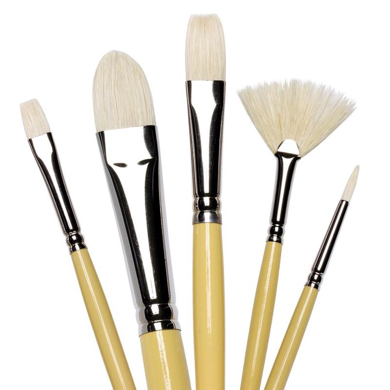
- Using the Wrong Brushes: Incorrect brush size or type hinders control and effects. Fix: Invest in high-quality brushes that suit your style. Use appropriate sizes for the area you’re painting—larger brushes for washes, smaller for details. (e.g., Da Vinci Maestro or Jackson’s Studio Synthetic).
- Being Afraid of ‘Happy Accidents’: Trying to over-control the fluid medium. Fix: Learn to work *with* unexpected blooms or back-runs. Sometimes these “accidents” add unique texture or movement. Embrace a degree of spontaneity.
- Neglecting to Plan: Jumping in without considering composition or color. Fix: Take a few minutes to sketch your composition and plan your color scheme. Test colors on scrap paper. A little planning saves a lot of trouble.
- Using Too Many Colours: Can lead to a chaotic, disharmonious result. Fix: Simplify your palette. Stick to a limited selection of colors that work well together. This promotes unity and balance.
- Ignoring the Importance of Patience: Rushing the process leads to poor results. Fix: Slow down! Let layers dry. Be intentional with your brushstrokes. Watercolour rewards a thoughtful, patient approach.
Exploring Alternatives to Watercolor Architectural Rendering
While watercolor architectural rendering offers a unique and appealing aesthetic, it’s not the only way to visualize architectural designs. Depending on the project’s goals, timeline, and desired impact, other rendering styles might be more appropriate. Here are a few common alternatives:
Pen and Ink Architectural Drawings
This is a classic drawing technique that uses pens to apply black or colored inks to paper, often creating images with strong areas of contrast and fine detail.
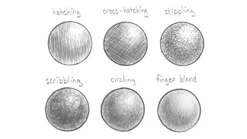
- Technique: Common methods include hatching (parallel lines), cross-hatching (overlapping sets of lines to create darker tones), stippling (using dots), random lines for texture, and cross contour lines to define form.
- Effect: Pen and ink drawings typically have a very clean, crisp, and finished appearance. They are excellent for showing detail and form with precision.
Architectural Collage Renderings
Originally an analog art form, collage has been effectively adapted for digital architectural visualization, often using software like Adobe Photoshop.
- Method: This involves combining various elements—such as textures, photographs of objects or people, and parts of 3D model outputs—into a single composite image.
- Characteristics: The final product often features rich textures but may intentionally lack realistic shadows or precise perspective, aiming for a more abstract or narrative-driven “not so real” visual. This allows for diverse interpretations from viewers.
Architectural Sketches (as a distinct final style)
While sketches are often a preliminary step, a polished architectural sketch can also serve as a final presentation style in itself, valued for its immediacy and directness.
- Purpose: Sketches are essentially rough or refined drawings used to communicate ideas concisely and quickly.
- Use: They are ideal for illustrating concepts before detailed project implementation, for quick on-site clarifications during construction, or when a deliberately informal and expressive style is desired for the final visual.
Hyperrealistic Architectural Renderings
At the opposite end of the spectrum from more artistic or conceptual styles, hyperrealism aims to create images that are virtually indistinguishable from high-quality photographs of a completed, real-world environment.
- Goal: To produce almost perfect digital replicas of how a project will look once executed.
- Achieved via software parameters: This level of realism is realized by meticulously adjusting various parameters within advanced rendering software, including sophisticated lighting setups, accurate material properties (opacity, texture, reflectivity), and detailed environmental modeling.
Each of these alternatives offers different strengths, and the best choice will always depend on the specific communication goals and aesthetic preferences for a particular architectural project.
The Broader Context: Watercolors in Art and Design
To fully appreciate watercolor architectural rendering, it’s helpful to understand a bit about watercolor as an art medium in general. Its unique properties have captivated artists for centuries.
The Fundamentals of Watercolor Paint
What makes watercolor, well, watercolor?
- How watercolor is made: Traditional watercolor paint consists of very finely ground colored pigments that are bound together in a water-soluble binder, most commonly gum arabic (a resin from the acacia tree). Some modern brands may also use synthetic binders. This binder is crucial because it allows the pigment to “bind” or adhere to the watercolor paper when water is applied. Gum arabic also tends to enhance the transparency of the pigment and can make it look more vibrant and glossy upon application. The intensity and translucency of the paint are controlled by diluting it with varying amounts of water.
- Other ingredients: To prevent the paint from drying into a completely hard, unusable block, and to extend its life and make it easier to re-dissolve, manufacturers often include a moisturizer (typically a type of glucose like corn syrup or honey) and a plasticizer (mainly glycerin).
Benefits of Using Watercolor in General Art
Artists choose watercolor for many reasons beyond just architectural depiction:
- Non-toxic (relatively): Watercolors are generally considered one of the safest types of paint available. While they may contain some mildly toxic content in certain pigments, it’s usually not enough to cause harm through normal use or incidental skin contact (though consumption should always be avoided).
- Easy setup and cleaning: Unlike oil paints or acrylics that might require special solvents or a more involved cleanup, watercolors are wonderfully straightforward. All you really need are your paints, some water, brushes, a mixing palette, and watercolor paper. Since the paint is water-soluble, cleaning brushes and palettes is as easy as rinsing them under running water.
- Affordable art supply: Watercolors are one of the most budget-friendly options for artists, especially for beginners. While professional-grade paints can be an investment, student-grade sets are very accessible. The one material that might lean towards the costlier side is good quality watercolor paper, which is specially designed to withstand water applications without buckling or tearing excessively.
- Quick-drying paint: Watercolor paint dries relatively quickly, often within a few minutes, as the water in the paint evaporates and leaves the pigment stained on the paper. This allows artists to apply additional layers without disturbing previous ones, although if you’re still impatient, a blow dryer (on a cool, low setting) can speed up the process.
- Alterable opacity: The hallmark of watercolor painting is its variable opacity, which is entirely dependent on its dilution with water. Adding more water to your pigment makes it more translucent and lighter in value. Conversely, using less water (a more concentrated pigment mixture) results in a more opaque and darker application.
- The paint is fragrance-free: While this might seem like an unconventional benefit, it’s a huge relief for artists who are sensitive to strong smells often associated with other painting mediums like oils and solvents. Watercolor’s generally non-toxic and odorless formula makes it a safe and pleasant choice for both kids and adults.
- Easy to rewet: Unlike acrylics, which dry to a permanent, water-insoluble film, dried watercolor paint on a palette can easily be reactivated by adding more water. This not only allows artists to work at their own pace but also significantly reduces paint wastage.
- The mesmerizing effects: The playful and often unpredictable nature of water interacting with pigment provides an opportunity for artists to explore a vast magnitude of beautiful and unique effects while painting, from soft blends and delicate washes to vibrant blooms and rich textures. The versatility of watercolor also makes it quite compatible with various other artistic mediums, allowing for alterations in texture, drying time, and overall appearance.
Drawbacks of Using Watercolors in General Art
The very same unique qualities that make watercolor so appealing also contribute to some of its main challenges, especially for beginners:
- Water control: The fluid nature of water is not always easy to control and requires considerable skill and practice to manipulate the results effectively. This can make it slightly difficult for newcomers to master this art form quickly.
- Unforgiving nature due to transparency: While transparency is a major factor in enhancing the beauty and luminosity of watercolor paintings, it also makes the medium quite unforgiving. Mistakes are often visible through subsequent layers.
- Quick drying time: The fact that the paint dries too quickly can also be a disadvantage, especially when trying to blend large areas smoothly or make adjustments to wet washes.
- Difficulty in correcting mistakes: Owing to all these reasons, if you make a significant mistake in your watercolor painting, it becomes almost impossible to completely rectify it. You might be able to lift some color or add more layers to try and cover your mistakes, but you often won’t be able to completely hide them. If you end up adding too many layers, the color can also lose its luminosity, becoming darker, muddy, and messy.
- Dries lighter: As mentioned earlier, watercolor typically dries a few tones lighter than it appears when wet. This requires artists to anticipate this shift.
- Fading potential: Some watercolor pigments are not highly lightfast and can fade quite quickly if the painting is exposed to direct sunlight for prolonged periods.
How to Pick the Right Watercolor Paint (General Advice)
With so many brands and types of watercolor paints available, choosing a good set can be confusing, especially for beginners. Here are a few parameters to consider:
- Lightfastness: This refers to the resistance of the color pigment to fading when exposed to light. Lightfastness essentially defines the longevity of your watercolor paintings. It can be assessed based on universal parameters set by organizations like the American Society for Testing and Materials (ASTM), which has three different ratings: ASTM I (Excellent), ASTM II (Very Good), and ASTM III (Not Sufficiently Lightfast). You can usually find this information on the packaging of the paintbox or tube.
- Transparency: Watercolors come in four different levels of transparency: transparent, semi-transparent, semi-opaque, and opaque. Colors that are more transparent are generally more luminous and bright because they allow the light to reflect off the white paper and pass back through the paint layer. For the best traditional watercolor effects, professional artists often recommend using predominantly transparent colors. However, if you desire a more chalky or solid appearance in your paint, more opaque colors might be a better choice for certain effects or accents.
- Color Quality and Pigment Load: Even if two different brands offer a paint with the same pigment name (e.g., “Cadmium Red”), remember that their actual tones and working properties can still be different. This is often due to variations in their pigment concentrations and the proportion of pigment to other ingredients (like binders and fillers) in the paint formula. A paint made with a high concentration of a single, pure pigment is generally much livelier and will mix more cleanly than a paint that has been made with multiple mixed pigments or a lower pigment load. This is also a key reason why your paint mixtures may become dull or “muddy” if you physically mix together too many different watercolor paints on your palette.
Taking the time to understand these qualities will help you select paints that will perform well and contribute to the success and longevity of your watercolor architectural renderings and other artworks.
Conclusion: Embracing Watercolor for Expressive and Unique Architectural Visualizations
We’ve explored the beautiful and multifaceted world of watercolor architectural rendering, from its historical roots and fundamental techniques to its modern digital adaptations and practical applications. It’s clear that this enduring art form offers a powerful and distinctive way to bring architectural visions to life.
Recapping the Value: Why Watercolor Architectural Rendering Endures
The continued relevance and appeal of watercolor architectural rendering stem from several key attributes:
- Its unique ability to evoke emotion and atmosphere: Watercolor can capture the intangible “feel” of a space in a way that more clinical or purely technical renderings might not.
- The artistic freedom it offers: Whether for initial conceptual designs or more finalized presentations, watercolor allows for a degree of artistic interpretation that can be incredibly expressive.
- Its power to differentiate and connect: In a world often dominated by digital photorealism, a watercolor rendering can help a project or firm stand out and forge a more personal connection with clients and viewers.
The Future of Watercolor in a Digital Age
Far from being obsolete, watercolor is finding new life and expanded possibilities in the digital era. We’re seeing an exciting synergy between its traditional charm and the flexibility offered by modern digital tools.
- Hybrid approaches: Many contemporary artists and studios, like Genesis Studios and Hugo Render, skillfully utilize both traditional hand-painting skills and sophisticated digital watercolor techniques, often blending them to achieve the best of both worlds.
- The enduring importance of artistic skill: Even with the most advanced digital software, the principles of good composition, color theory, understanding of light, and a skilled artistic eye remain paramount for creating compelling watercolor-style renderings. The tools may change, but the artistry endures.
Final Encouragement: Experiment and Find Your Watercolor Voice
Whether you are an architect looking to commission a rendering, a designer exploring new visual styles, or an artist wanting to delve into architectural subjects, watercolor architectural rendering offers a wonderfully rewarding path. The key is to understand its potential, decide on your end goal, and pick a workflow—be it manual, digital, or a hybrid—that suits your needs and vision.
The beauty of watercolor, as many artists attest, lies in its slightly unpredictable nature, its luminous washes, and its capacity to surprise and delight. It’s a medium that encourages experimentation and allows for the development of a truly personal style. So, grab a brush (physical or digital!), some colors, and a piece of paper, and start exploring. You might just find that the “enigma that makes watercolor a bag full of wonders” is waiting for you to uncover its magic in your own architectural creations.